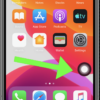
Recently Instacart, ScrabbleGo, and Google’s apps such as Gmail and YouTube underwent disruptive redesigning. Curiously, the redesigned apps featured saturated, color-clashing designs.
While updating, upgrading, and redesigning apps help to improve and give them a competitive edge in the fast-changing world of technology to avoid falling behind, in some instances some changes can go terribly wrong and put users off.
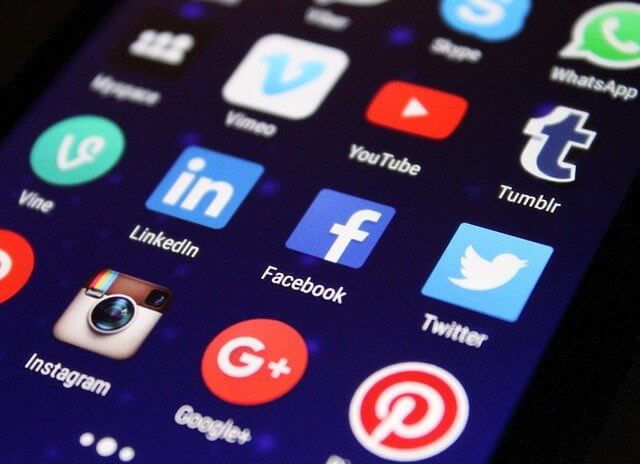
Technology companies seem to be in a race to make their app icons the most colorful, vibrant, and bright. They probably do this to ensure that their icons and products are not missed in preference to their competitors. And that is how we end up with apps that literary jump at you and scream for your attention whenever you unlock your device.
In their effort to grab your attention designers often use combinations of colors to make their apps stand out. Unfortunately, some of the color combinations, saturations, and designs not only hurt the eyes but can also lead to overthinking and even confusion, as many apps and their icons have a similar appearance. Eventually, this can cause cognitive overload.
Unfortunately, some of the color combinations, saturations, and designs not only hurt the eyes but also leads to overthinking and confusion as most apps have similar colors and patterns. Eventually, this causes cognitive overload.
The Internet Patrol is completely free, and reader-supported. Your tips via CashApp, Venmo, or Paypal are appreciated! Receipts will come from ISIPP.
CashApp us

Venmo us

Paypal us
Cognitive overload refers to a situation where your working memory has already received the maximum information that it can handle in a given moment, but the information keeps on coming. This leads to impaired decision making and frustration as the user is unable to process all the data at hand.
Ideally, user interface design should aim at giving users a straight path to their goal, rather than creating use obstacles such as poor or clashing interface designs. At the most basic level, a user is not supposed to notice the app design or interface. Why? Because the user is rarely there for the aesthetic value of the app; the user is there because they want to accomplish something and using the app or website is a means to that end. The more a user focuses on the app interface, the less they will accomplish anything with the app.
Complicating and confusing users with designs and interfaces is similar to standing the user in the path of a speeding train. You know such experiences rarely end well, right? You know such experiences rarely end well, right?
Unfortunately, the cognitive overload trend does not show any sign of slowing down. In the future, technology companies are likely to use highly saturated, color-clashing, and probably bigger designs to outdo their rivals in the race for our attention. App designers seem to have declared war on our attention, and we already don’t even have much of it to spare as there are many other distractions vying for that attention.
Hopefully, app designers will change course, and instead of seeking out the most attention-grabbing colors and designs to outcompete with their rivals, they will instead start thinking about their users’ needs, and making it easier for their users to meet those needs. Wouldn’t that be a nice turn of events? Hey, it could happen!
The Internet Patrol is completely free, and reader-supported. Your tips via CashApp, Venmo, or Paypal are appreciated! Receipts will come from ISIPP.
CashApp us
Venmo us
Paypal us