- Target Will Match Amazon Prices on the Spot!Here is How to Get that Amazon Price at Target - 8/8/2018
- Washington Post Columnist Suzi Parker Erroneously Reports Satirical Story About Sarah Palin Taking Host Position with Al Jazeera - 12/10/2016
- Android People App on Google 4.2 Operating System Jelly Bean Omits Entire Month of December from Calendar - 12/10/2016
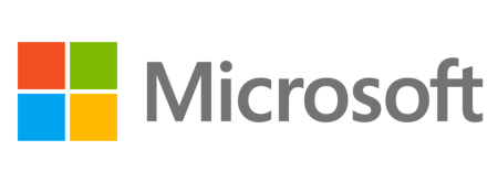
If Microsoft wanted to play it safe when designing their new logo, they pulled it off flawlessly. While a few are calling the new logo “great,” and a few are calling it “awful,” it seems the overwhelming response is “meh.”
There is no denying that they didn’t take any big risks with the simple design, which does not stray far from the logo they’ve had for the last 25 years. Four colored squares, which are essentially a non-flag version of the old squares, sit next to the word “Microsoft,” in a clean and simple font. According to the video Microsoft included in the blog post announcing the new logo, blue symbolizes Windows, orange symbolizes Office, and green symbolizes Xbox. They didn’t equate yellow to anything.
Microsoft’s general manager of brand strategy, Jeff Hansen, said of the design, “The logo has two components: the logotype and the symbol. For the logotype, we are using the Segoe font which is the same font we use in our products as well as our marketing communications. The symbol is important in a world of digital motion (as demonstrated in the video above.) The symbol’s squares of color are intended to express the company’s diverse portfolio of products.”
The company is getting ready to introduce updated versions of products such as Office and Windows, so with a new product lineup comes a new logo. Says Hansen, “This wave of new releases is not only a reimagining of our most popular products, but also represents a new era for Microsoft, so our logo should evolve to visually accentuate this new beginning.”
The Internet Patrol is completely free, and reader-supported. Your tips via CashApp, Venmo, or Paypal are appreciated! Receipts will come from ISIPP.
While Microsoft claims that the logo took 6 months to develop, which included input from Microsoft employees, The Washington Post claimed they were able to recreate a similar logo in minutes with Microsoft Paint. We hope that the changes to come in their products reveal more, you know, change.
The Internet Patrol is completely free, and reader-supported. Your tips via CashApp, Venmo, or Paypal are appreciated! Receipts will come from ISIPP.
