Harvard has publicly released an online tool which tells you in real time which counties in your state are current Covid19 hotspots. The Covid-19 risk assessment map, part of Harvard Global Health Institute’s online COVID risk assessment dashboard, uses the familiar green, yellow, orange, and red color coding to indicate counties which have relatively few new cases, those which bear watching, and those which have a high number of newly confirmed cases. The measure is new cases per 100,000 residents.
Explains Danielle Allen, director of the Edmond J. Safra Center for Ethics at Harvard University, “The public needs clear and consistent information about COVID risk levels in different jurisdictions for personal decision-making, and policy-makers need clear and consistent visibility that permits differentiating policy across jurisdictions. We also collectively need to keep focused on what should be our main target: a path to near zero case incidence.”
“The assessment levels are based upon the number of new daily cases per 100,000 people. If a community has fewer than one daily new case per 100,000 people, it is colored green, which HGHI says is “on the path to containment.” Between one and nine cases is labeled yellow, which means there is some community spread. Between 10 and 24 is orange, meaning that COVID-19 has “accelerated spread,” explains Forbes.
![]()
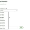
The way that it works is that you go to the Harvard Covid-19 hotspot tracker here, make sure that “Counties” is selected (see image) and select the state for which you want information.
The Internet Patrol is completely free, and reader-supported. Your tips via CashApp, Venmo, or Paypal are appreciated! Receipts will come from ISIPP.
CashApp us

Venmo us

Paypal us

Harvard’s Online Covid-19 Hotspot Tracking Tool
![]()
Note that the states are listed not in alphabetical order, but in order of most newly reported cases per 100,000 to least newly reported cases per 100,000.
Good going, Vermont and Hawaii!
![]()
Click on the + symbol next to the state for which you want information, and the right-hand sidebar display changes from state names to the counties within the state that you selected, sorted, again, by color, counties with the highest new cases per 100,000 down through the counties with the lowest new cases per 100,100.
![]()
As it turns out, as of today, July 1, 2020,there are no counties in Florida that are coded green, however if you have to be in Florida, Liberty, Sumler, and Dixie counties seem the safest bet.
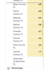
Because it’s not alphabetical, and there is no open search function for the tool, you will need to just scroll down until you find your county – the good news is that the more you have to scroll, the better off your county is likely to be in terms of numbers of new cases.
So, where does your county fall, green, yellow, orange, or red?
The Internet Patrol is completely free, and reader-supported. Your tips via CashApp, Venmo, or Paypal are appreciated! Receipts will come from ISIPP.
CashApp us
Venmo us
Paypal us